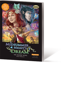
I’ve finally finished the second of the two graphic novel adaptations of Midsummer I checked out from the library: Classical Comics‘ “Original Text” version of the play.
That phrase “Original Text” is crucial, for it points to the way that this company takes a different approach to creating a Shakespearian on-ramp than Stone Arch Books did.
 Classical Comics is a UK-based company who seems to focus on classrooms and libraries as their core market segment, creating graphic novel adaptations of canonical literature for struggling/resistant readers. Their approach to the unfamiliar vernacular of these writers is both similar to and different from Stone Arch’s modern translations:
We publish multiple versions for each of our titles. Simply choose which text version is right for you. Shakespeare titles are available in Original Text, Plain Text and Quick Text. Classic literature titles are available in Original Text and Quick Text.
The Original Text versions contains — you guessed it! The Plain Text version provides a modernized translation that echoes the original sentence structure and imagery — akin to Stone Arch. The Quick Text version, meanwhile, is vastly abridged.
So, using the example Classical Comics provides in their profile of Midsummer, Lysander’s lines 2.2.41-44*:
Fair love, you faint with wandering in the wood.
And, to speak troth, I have forgot our way.
We’ll rest us, Hermia, if you think it good,
And tarry for the comfort of the day.
Become, in the Plain Text version:
My love, you look like you are about to faint from wandering in this forest. To tell you the truth, I think we are lost. We can rest here and wait for morning.
And then are further reduced for the Quick Text thusly:
You look like you are about to faint. We can rest here until morning.
Now that I understand this company’s market, I am more persuaded by this approach than I was initially. When I was reading through the graphic novel, I was in the headspace of thinking about individual families and readers purchasing these, and it seemed prohibitively costly to be buying multiple versions of the text in order to progress through different levels of textual sophistication. Now that I see the possibility of a school or library having a full set that carries a title across textual levels, I can more readily imagine these as a teaching tool. (The company has also created teacher’s resource kits to accompany many of their titles.)
I still wish that these were available in a e-book “bundled” version that allowed you to toggle between reading levels. I think that would be fantastically useful. (This feature — alongside lots of other bells and whistles — looks to be part of the new “Interactive Motion Comics” they’ve created for Macbeth and R&J. Alas, that $135 price tag is a little rich for my blood. Again, I can see how this is pitched more towards schools and libraries.)
The characters and artwork are credited to Jason Cardy and Kat Nicholson. You can see samples of some of the most imaginative/lovely bits of the comic here in Nicholson’s online portfolio. I think for the most part the artwork is successful: those lovely bits are very lovely indeed, and the work as a whole makes decent use of the visual language of comix to indicate motion, perspective and symbolism.
There’s some elements I’m less fond of, like the faces of the four young lovers. I honestly can’t tell you if they’re drawn too realistically or not realistically enough, but there’s just something unsettling to me about their appearance. (A similar style works to grand effect when communicating the ways that Oberon, Puck and the faerie folk should look unsettling.)
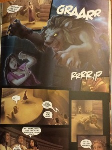
 I also wish they hadn’t perspective-shifted so much during the performance of Pyramus and Thisbe in 5.2. The photo here shows the shift between the theatricality of the actual performance at Theseus’ wedding reception, to a realistic depiction of the story this play is trying to evoke, and then back again. This seems really off-track to me as a visual interpretation: this whole scene hinges on the absolute ineptitude of the mechanicals in invoking the atmosphere and setting of the tale they’re trying to portray, and I think this choice to enter the mechanicals’ imagination (where they see themselves succeeding in their performance) badly muddies the water.
Still, there’s much more good than bad here. Nothing I see myself wanting to add to my personal library, but I’d be interested to check out other titles in the series.
Finally, in the interest of “best practices” in writing reviews, here’s a couple more credits. The lettering is by Jim Campbell — alas, I don’t know enough about the finer points of lettering to make any criticism regarding that element, good or bad. The script adaptation was done by John McDonald. I think the storyboarding of the play works pretty well, and obviously, I really have nothing to say about his textual adaptations for the “Plain” and “Quick” versions of the play, since I didn’t see those.
* Line references to the Folger Library paperback edition. Copyright 1993.
———-
Image credits: Cover: Classical Comics. Unaltered. Used without permission.
Thisbe and the lion: MezzoSherri’s iPhone.

